
Currently Empty: 0,00 $
Auto Layout in Figma is a feature that allows designers to create flexible and responsive designs by automatically adjusting the size and alignment of elements within a frame. The primary purpose of Auto Layout is to ensure that design components dynamically respond to changes like text length or screen size. This feature simplifies the creation of consistent and adaptable wireframes and prototypes, making it particularly useful for responsive design systems.
Auto Layout operates in a manner similar to CSS Flexbox or Grid in web development, enabling designers to create scalable, flexible, and responsive designs with ease.
In essence, Auto Layout allows you to effortlessly manage the alignment, spacing, and distribution of design elements, usually with just a few clicks.
Step-by-Step Guide to Adding Auto Layout
Use this guide to quickly integrate and utilize Auto Layout in your designs.
Enabling Auto Layout
Activate Auto Layout using one of these methods:
Select any elements or frames and press the keyboard shortcut `Shift + A`.
Right-click an object or frame in your design and select “Add Auto Layout” from the menu.
Locate the “Layout” section in the right-hand menu and click the button resembling a square with three shapes.
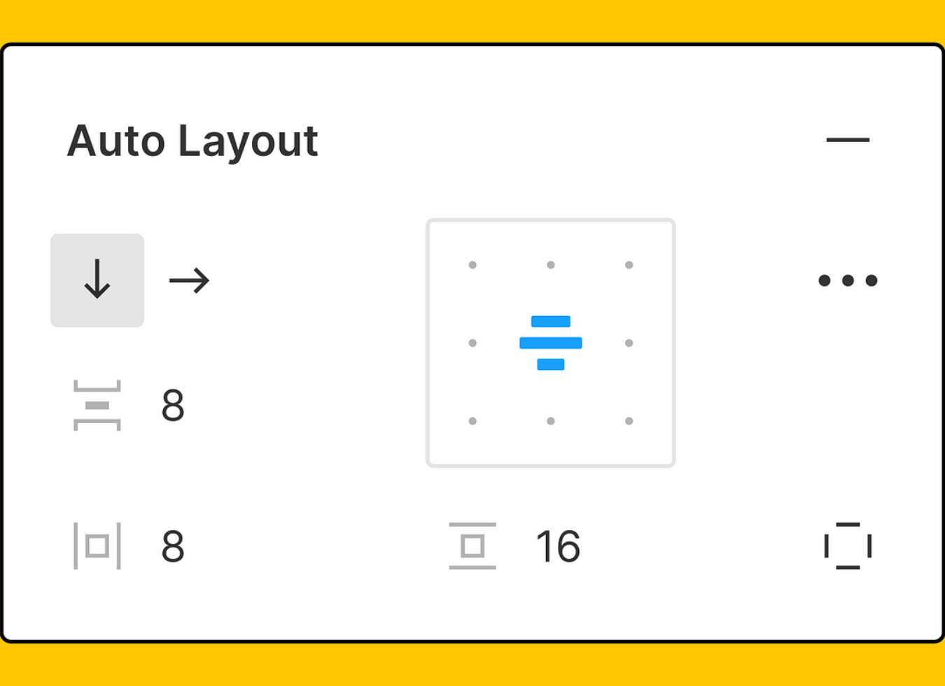
Adjusting Auto Layout Properties
Modify Auto Layout settings in the right panel:
– Set the direction (horizontal or vertical).
– Define spacing between items.
– Add padding inside the frame.
Experimenting with Resizing Options
Explore different resizing options:
Fill Container: Elements expand to fill the frame.
Hug Content: The frame adjusts to fit the content.
Fixed Width or Height: Elements maintain a fixed dimension.
Pro Tip
When designing buttons in Figma, use Auto Layout to ensure they maintain consistent padding and alignment, even when the text or icons inside them change.
Using Auto Layout for Responsive Design
Auto Layout is particularly effective for creating designs that adapt to various screen sizes, from desktops to tablets and smartphones. A critical concept in using Auto Layout for responsive design is the parent frame—the container holding your Auto Layout elements. By nesting Auto Layouts (using one Auto Layout frame within another), you can achieve highly flexible layouts that seamlessly adapt to changes in both content and screen dimensions.
For example, when designing a navigation bar or card component, Auto Layout ensures that elements like buttons or icons adjust flawlessly across different screen sizes. Nesting Auto Layouts allows even complex designs to be resized effortlessly.
So, if you’re working on a web design project that caters to multiple devices, Auto Layout will be an invaluable tool in your arsenal.
Tags: